Wednesday, December 8, 2010

Drawing Without Paper Review


So I realize this is laaate, but better late then never.. right??

Crit notes/ideas were as follows:
     For the Wire Model:
          -Big moments and small moments but no in between moments
          -Something in between thin and thick (wire)
          -Lack of togetherness
     For the Wax Model:
          -Line as layers - used to create  a wholistic experience
          -Small pieces where color seeps in

Pretty pictures:


As for now, I'll be finishing work on the final model, which is almost done, I just need to add a ramp, redo the roof piece, and work on the site, wohoo!  Tonight, however, is a Con/Mat night, sooooooo trying to finish the model tomorrow and start on the drawings for the final presentation.. yikes!

Monday, November 22, 2010

Final Wax Casting


For my final mold I used foam core coated with non-stick aluminum foil (this took FOREVER) and a thin layer of vaseline.  I poured the wax in slowly using a ladle and a spoon.  To make the colored spaces I cut up small pieces of crayon and poured the wax in over them.  I still had to pull the foam core away piece by piece, but it was much easier to take out of this mold than my previous mold, of just chip board.

Friday, November 19, 2010

Drawing Without Paper Studies Continued...

So I've been trying to further my "drawings" without paper.  Here's what I've got:

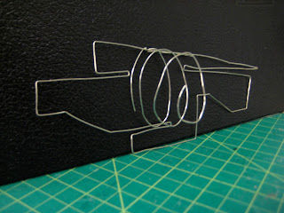
This is a section constructed with wire.

When turned sideways, the section has depth, although these spaced created by the pushing of planes do not model the actual building.  Today I tried making this same model with a thicker gauge wire, but it was softer than the thin gauge so I'll be trying to find some other metal, possibly at Benny's instead of Michael's. (besides, Michael's was playing Christmas music.. UHG!)

This is the mess left over after pulling the chipboard away from my wax cast.  I think I'll try working with foam core instead of chip and possibly covering the mold in either vaseline or tinfoil to make the removal a bit easier.

Here is the casting.  The floor plan was supposed to have a rectangle around it representing the paper but I ran out of wax last night causing the "paper" to be only about 1/4" thick.  Most of this "paper" broke off and the plan broke right down the middle.  Moral of the story, MORE WAX!

The casting with all the broken "paper" pieces on the left.

Where the floor plan broke.  Jason and I were able to fix it with a bic liter and some extra wax.

Tuesday, November 16, 2010

Drawing Without Paper Studies

So I started the "drawings" and here's what I've got so far:

Wax in the mold

Remains of the mold

First Floor Plan (backwards)

First Floor Plan (backwards)

Section Study 1

Section Study 1

Section Study 2

Section Study 2

First Floor Plan Study

First Floor Plan Study

Friday, November 12, 2010

Drawing Without Paper

Today we were given the new assignment, we will be doing drawings without paper.  We must produce two "drawings," one will be tectonic and one will be stereotomic.  The tectonic drawing should be made of wire, string, or thin pieces of wood.  The stereotomic drawing should be made by either casting with material such as wax, plaster, or cement or made by carving.  So I'll be making a trip to Michael's for some wire and Stop and Shop for some wax and we'll see what I can come up with for Tuesday.

Tuesday, November 9, 2010

Sketchy Sketchy!

So 10 feet + of 6" trace later (I haven't actually measured it) and I'm still up against a brick wall... kind of...

After looking at works by Mary-Ann Ray, Brodsky and Utkin, Piranesi, and Cooper Union students, I drew like crazy, got some ideas, and came up with some different plans.  Now the challenge is to incorporate these ideas into my original project.  Essentially, the project is trying to put these ideas into my project... easier said than done.

So more drawing, more sketching, and hopefully getting something hard-lined for tomorrow.

The Drawing


SOME SAMPLES:

Early Section

Ideas from the Books

Section with Bridges

More Sketches from the Books


Floor Plan at End of Roll

Some Sketchy Perspectives

Friday, November 5, 2010

More Inspiration: Ramps

McCormick Tribune Campus Center, Rem Koolhass OMA
http://www.stairporn.org/category/ramps/

Edge House, Noriyoshi Morimura
http://www.stairporn.org/category/ramps/

Art Gallery of Ontario, Frank Gehry
http://artmatters.ca/wp/2007/01/

Art Gallery of Ontario, Frank Gehry
http://www.designboom.com/contemporary/art_gallery_of_ontario.html

Guggenheim, Frank Lloyd Wright
http://www.new-york.me.uk/guggenheim_museum.htm

Tuesday, November 2, 2010

Mid Crit Notes

As of now, my building looks like a giant 140' long and 30' tall wedge.  As you walk in (at grade) you enter the lobby/gallery space.  Directly below this space is concessions, restrooms, and tickets for the films.  Across from this is the library, above which are offices and the conference room.  Below the library is one of the smaller theaters.  In this theater, movie-goers watch films on small screens attached to the head rest of the seat in front of them and use a pair of headphones (similar to an airplane).  Below this is the other small theater, and across from that is the large theater.  Both of these theaters are set up like a typical movie theater with stacked seating leading down to one big screen.  Below these theaters is the archival space.

Section (Enter from the left)

Model with one side wall removed

Model

Model

Model

The crits discussed these points:

     -the possibility of a walk through building and bringing public programing to the top 
     - maybe add a cafe as a stopping point on campus

     -making the top lower or at less of an angle so it could almost be missed - or pushing
     it down and making the entrance below grade - don't have a typical front door

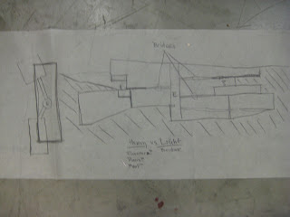
     -the concept of light and airy (on top) vs. dark and heavy (on bottom)

     -plug vs. path (on the site) - have an attitude and why

     -with the idea of weaving -> how does the building weave into the site/pedestrian path?

     -possibility of making the building longer - how to slither across the site

So, more development for tomorrow.

Wednesday, October 27, 2010

Some Inspiration

So more designing for today.  Friday is our mid crit.. Yikes!  Here are some pictures and places I'm using for inspiration:


The Tate Modern Museum.  This building has spaces sticking out into the main space (see the aqua colored rectangles).  <http://art-museum-guide.com/tate-modern-museum.html>

NYU Department of Philosophy by Steven Holl Architects with an interesting set of stairs.  <http://www.dezeen.com/2007/10/05/nyu-department-of-philosophy-by-steven-holl-architects/>


The entrance to the Paris Opera.  Showing a grand staircase.  <http://forum.skyscraperpage.com/showthread.php?t=160943&page=14>

Monday, October 25, 2010

Pictoral Collage

Here are the pictures of my pictoral collage.  The pictoral collage is a further study of site analysis.  All the pictured used for this collage were taken from the trip to Harvard.

The main idea behind this is that there is a bar running diagonally from the bottom left corner to the top right corner which represents my long, linear site.  The stairs used to make this bar represent the rigidness of Harvard Yard (by the library) vs. the red pieces which show the chaos and organic-ness of the Carpenters Center.  Going out from the site are pathways connecting to other buildings on the site and eventually the trees in the top left and bottom right corners.  (If you click on the images they will get bigger.)

Whole collage on the wall

Whole collage

Detail of the Library

Detail of the Carpenters Center

Detail of the Weld Building